ArrowTop iOS
UI/UX

Arrow Top is an iOS social media platform based around creating photographic trends for friends and followers to replicate, in an attempt to gain more likes than the creator of the trend.
I was contracted with Arrow Top to re-design their onboarding process before their big launch to investors a few months later. Previously, they had gone through a few changes of terminology and features which had left the app in a slightly confusing place, which prompted their decision to change their onboarding process to help prep and guide users through their changes.
The Objectives
Create a Competitive Comparative analysis
Create a Site Map, User Flow and Use Case
Sketch out wireframes
Produce a clean UI design
Create a shallow learning curve for the users
An efficient Onboarding Process
Competitive Comparative analysis
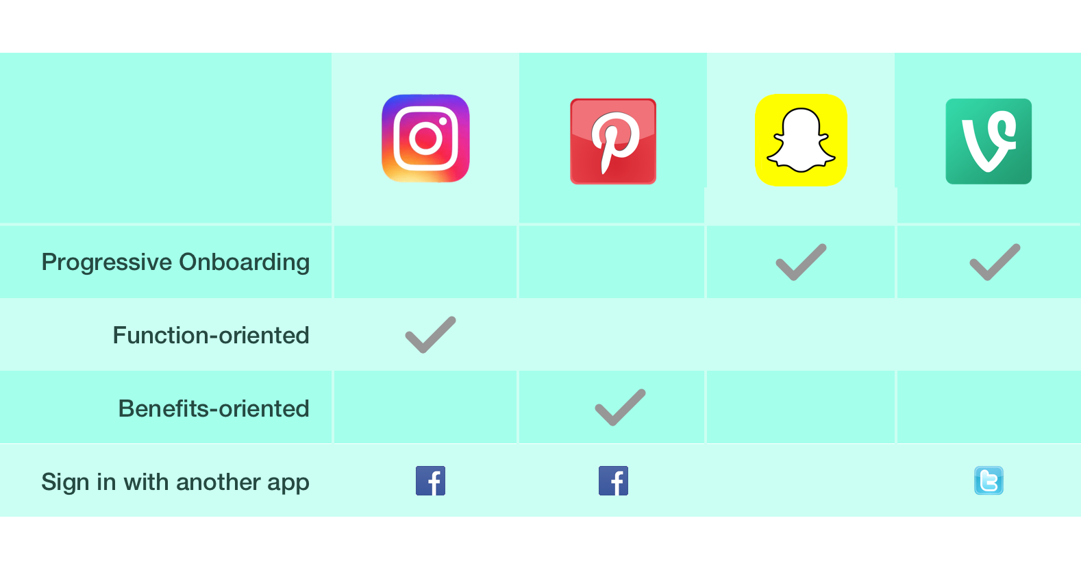
Since Arrow Tops demographic is yet to be identified, I took a look into the market of Trend setting, Inspiration and image centric applications to see what features were being used and to later look into how these features were being received.I looked at the current three most common styles of onboarding new users, to assess which approach would be most suitable for Arrow Top and their current state of design.
Progressive Onboarding
Simply, this gives the user an instructional walk through the primary flow of the app by approaching a ‘Learn by Doing’ style.
Function-oriented Onboarding
This approach looks more into how a user can get started within the app and what features are most common, when to use these features and any interaction specifics. For example, ‘double tap to like a photo.’
Benefits-oriented Onboarding
This style explains what the app is, how and when a user can use it in their day and the benefits of doing so.

Following from looking at these apps and the various tear downs available on each one, I came to the decision within my sprint that I should stick to these rules listed below, refine and test when possible to help me produce the simplest Onboarding experience.
Allow users to sign up via Facebook or Google
Develop a tag line to give a brief synopsis
Show the user the benefits of the app — don’t go through all the features
Use a language that is comprehensible to all users
Be human and have personality, not robotic
Keep the user informed on their orientation by including a progress bar or steps
Contextual Inquiries
During week 1, I took the existing application to 8 people within the suspected demographic, gave them 5 tasks to complete and followed up asking a few questions about their experience.
The Tasks
Create an Account
Follow someone
Join a Trend
Like a post
Create your own Trend
Casually testing the flow gave me the insight into their behaviour vs their attitude which enabled me to identify the pain points I would later tackle in creating an intuitive onboarding experience.
For most, their attitudes were slightly frustrated when asked about their over all experience, some had valid comments about how they would like to see the app improve for either its feature terminology or UI.
“I don’t know what a Trend is, so I don’t understand what I’m joining”
However many of the users behaviour had shown that the structure and sitemap was intuitive as they seemed to find their way through smoothly, but were stopped in their tracks when prompted to complete an untraditional task like ‘Joining a Trend’.

I found the common problems were either because users were not paying attention to the text and looking for visuals to guide them through, or the concept of responding to trends wasn’t clear so the tasks were becoming confusing and slightly mundane.
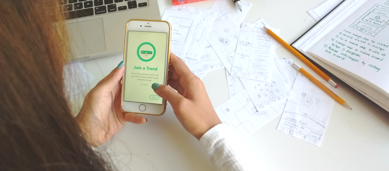
Sketching
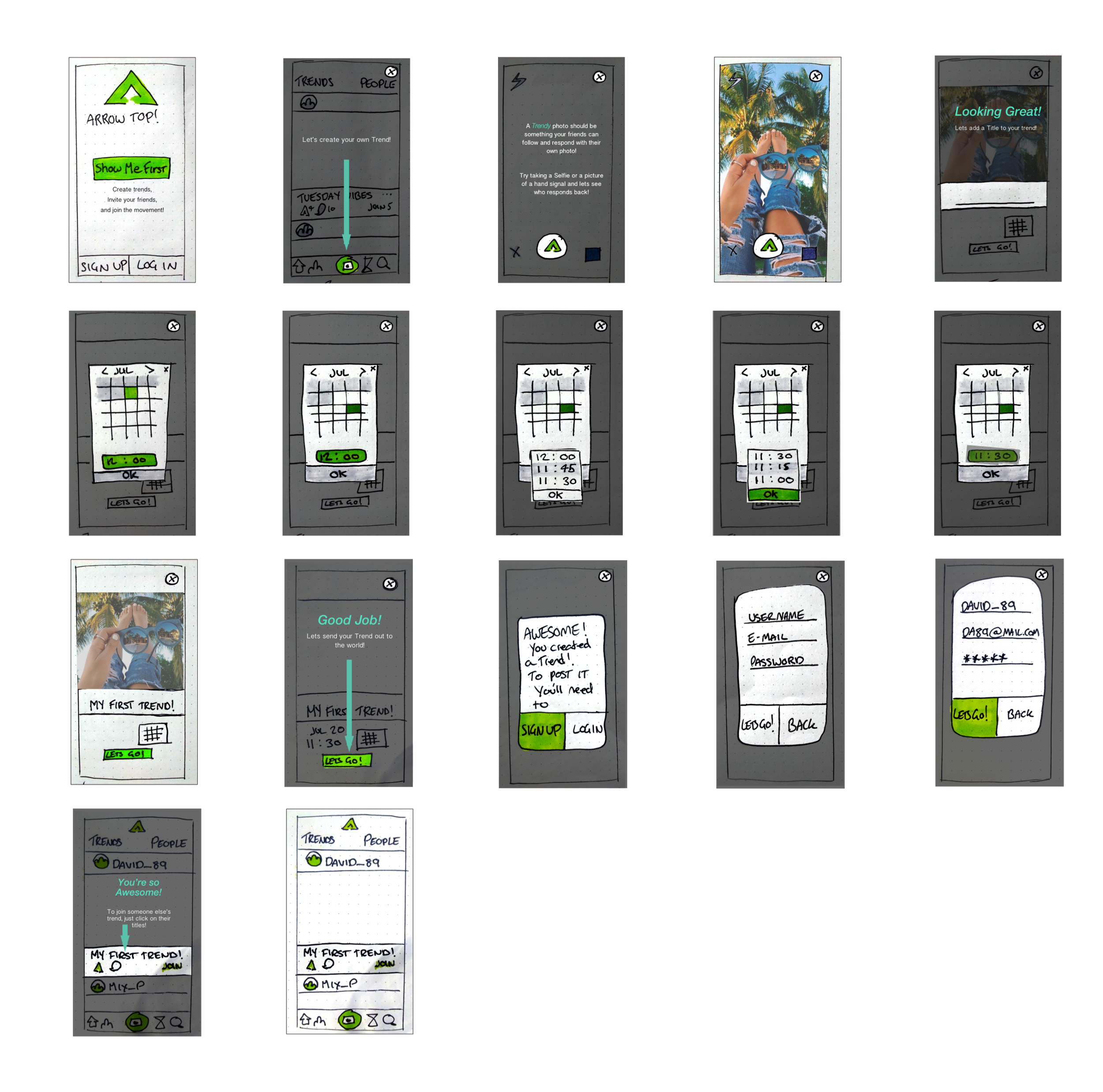
I did 4 rounds of testing which you can see in detail on my Medium account. Here’s a snapshot into the final product
Final Design Approach:
Progressive Onboarding
Sign up after user is onboarded
Minimal Text and clear direction on what is clickable
Allow their trend to be posted in which they created via their onboarding process
